My Work
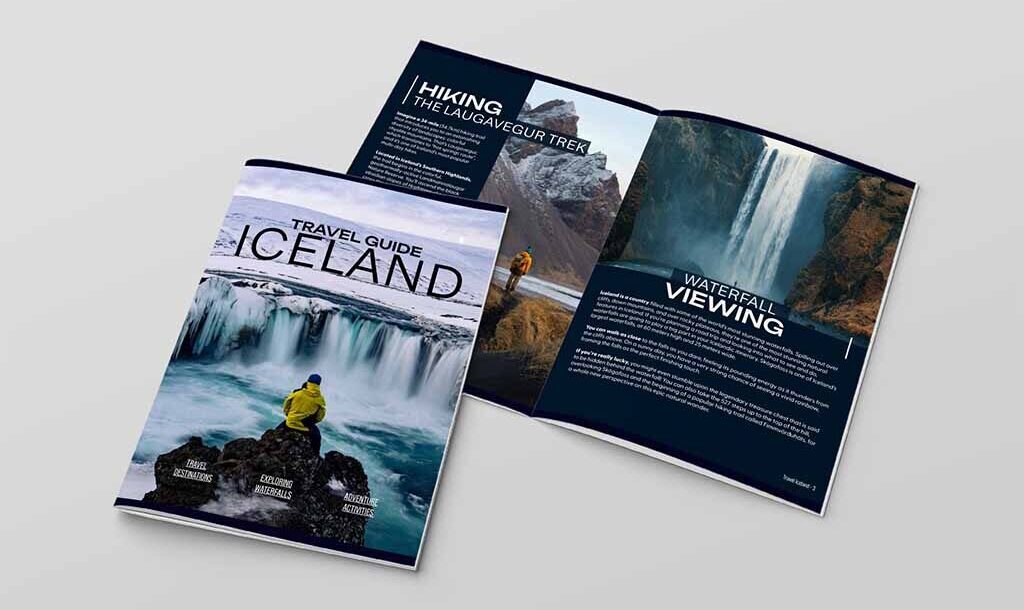
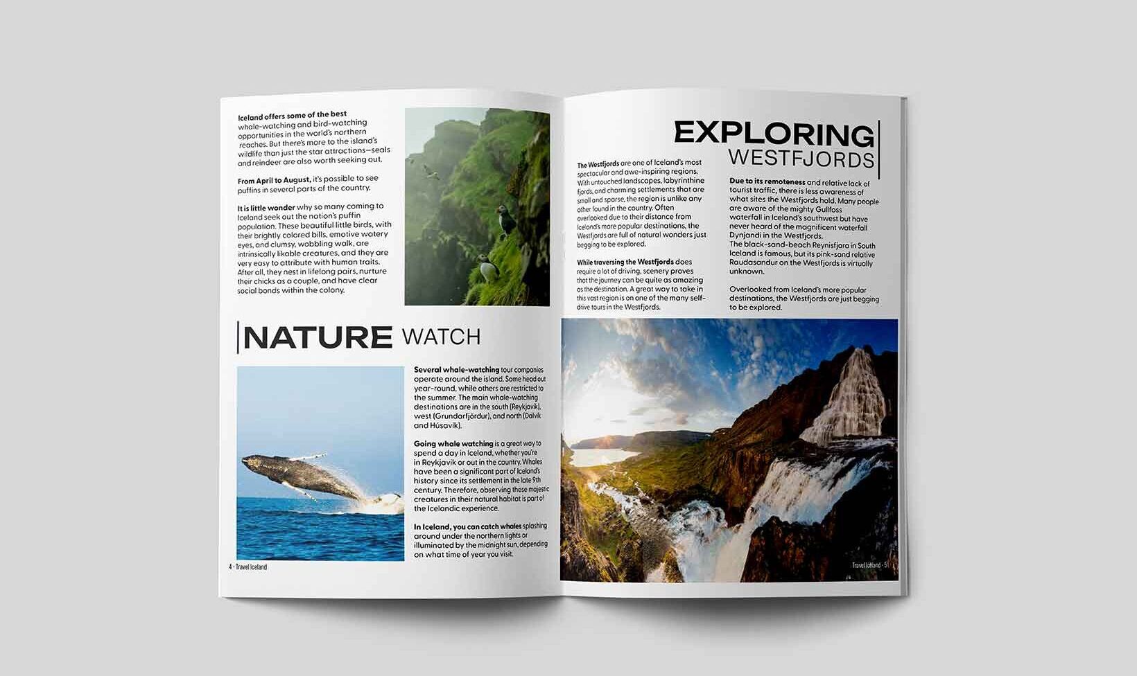
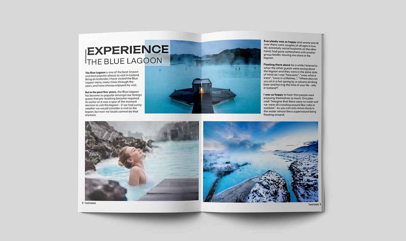
Iceland Magazine
This editorial travel magazine was created in Adobe InDesign to showcase Iceland’s landscapes, culture, and travel experiences through a visually engaging layout. The project was also developed as an interactive online version, allowing viewers to experience the magazine digitally while highlighting my skills in publication design, typography, layout, and visual storytelling.
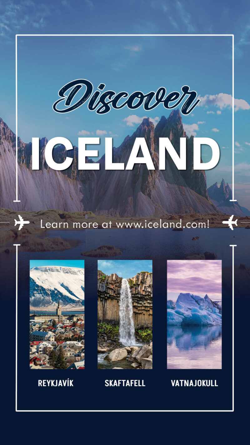
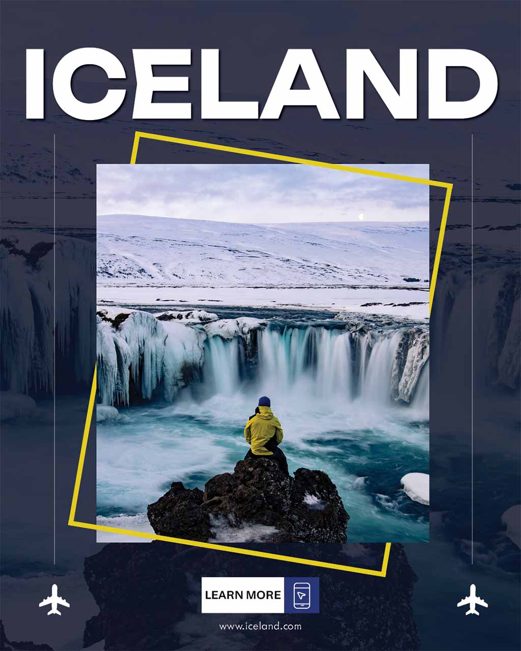
Iceland Ad Campaign
This advertisement series was created as a companion project to my Iceland travel magazine, using bold imagery and editorial-inspired layouts to promote Iceland as a travel destination. Designed in Adobe InDesign, the ads were developed to visually connect with the magazine through consistent typography, composition, and overall style, while also highlighting my skills in advertisement design, layout, and creating cohesive branded pieces across multiple formats.

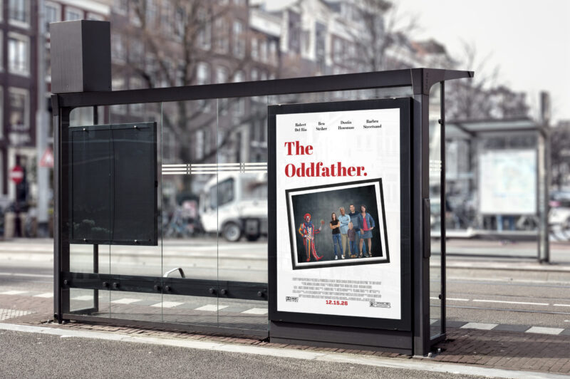
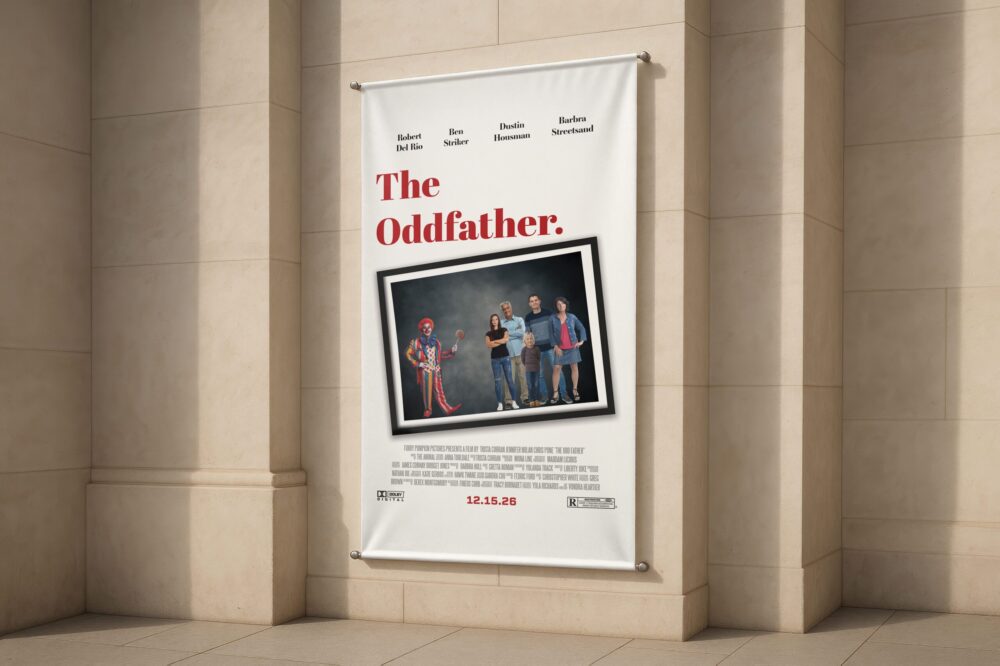
Parody Movie Poster
This movie poster was created in Adobe Photoshop as a parody concept based on the prompt “The Oddfather.” Inspired by classic film poster design, I combined bold typography, a clean layout, and a humorous visual composition to create a poster that blends recognizable cinematic styling with playful storytelling. This project allowed me to explore poster design, hierarchy, and visual balance while adapting a parody concept into a polished promotional piece.
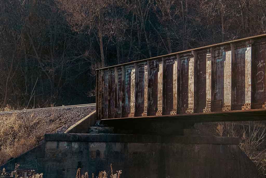
Photography
This photography collection was created as my final project for photography class, showcasing a range of images that focus on composition, lighting, perspective, and visual storytelling. Each photograph was carefully selected and edited in Adobe Lightroom to enhance color, contrast, and overall visual impact, reflecting my growth in both technical skill and creative direction while demonstrating my ability to create polished, intentional imagery across a variety of subjects and settings.


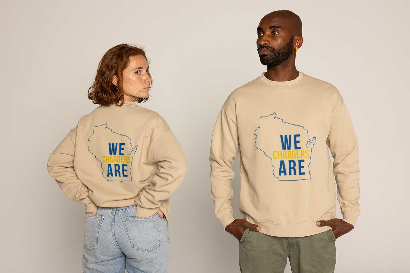
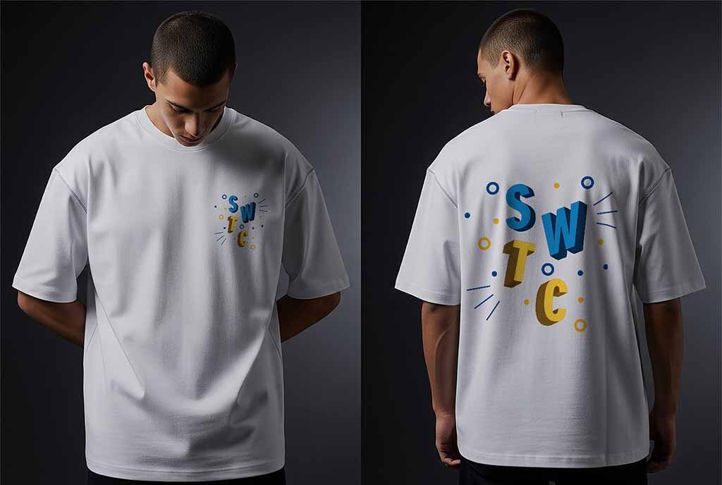
T-Shirt Designs
This design series was created for Southwest Wisconsin Technical College as spirit wear concepts that could also be adapted into sticker designs, allowing the graphics to work across multiple branded merchandise formats. Created in Adobe Illustrator, the collection includes a sweatshirt design featuring the outline of Wisconsin and the phrase “We Are Chargers” to emphasize school identity and location, along with a t-shirt design that uses bold, playful typography and layered letterforms to highlight SWTC in a fun and energetic way. Across both designs, I focused on creating versatile graphics and cohesive front and back layouts that feel modern, readable, and visually engaging while showcasing my skills in apparel design, typography, and creating adaptable merchandise concepts.
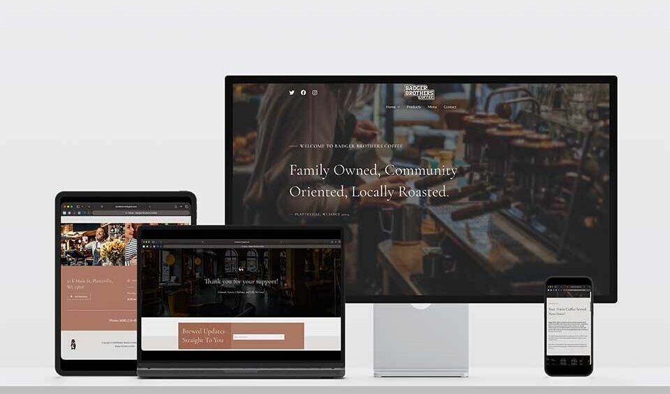
Local Website Re-Design
This website redesign project refreshed the online presence of a local coffee shop through a more polished, welcoming, and user-friendly digital experience. The project began with sketching and wireframing, using Figma to plan the layout and user flow before being built in WordPress. Focused on both branding and usability, the redesign features warm visuals, improved navigation, responsive layouts, and organized content to create a functional site that reflects the business’s inviting and community-centered atmosphere.

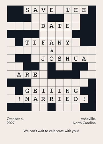
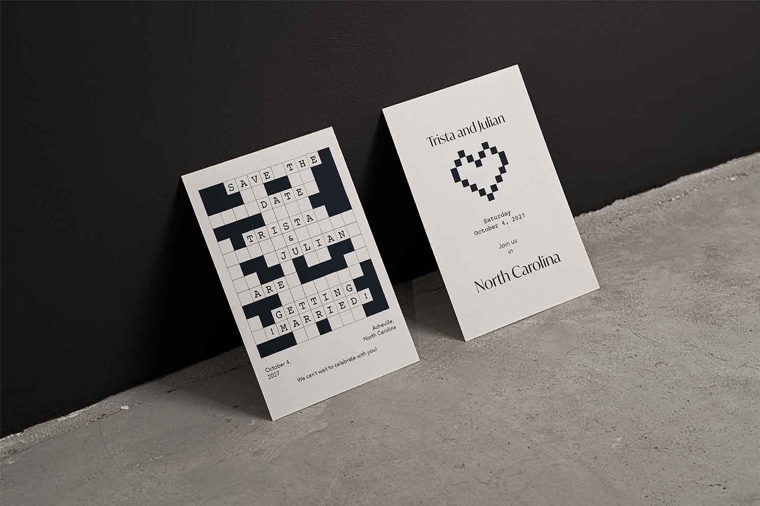
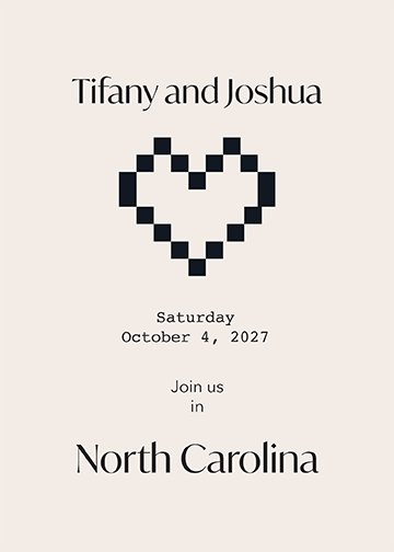
Wedding Invitation
This wedding invitation suite was designed in Adobe InDesign as a modern stationery concept that combines clean typography with playful, personalized details. Featuring a custom crossword-inspired layout and a pixel-style heart graphic, the design creates a unique invitation system that feels both minimal and memorable. This project allowed me to explore print layout, typographic hierarchy, and cohesive design across multiple pieces while balancing creativity with clarity.
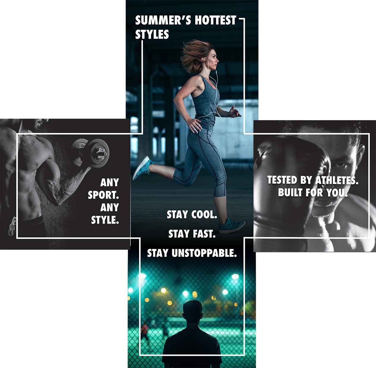
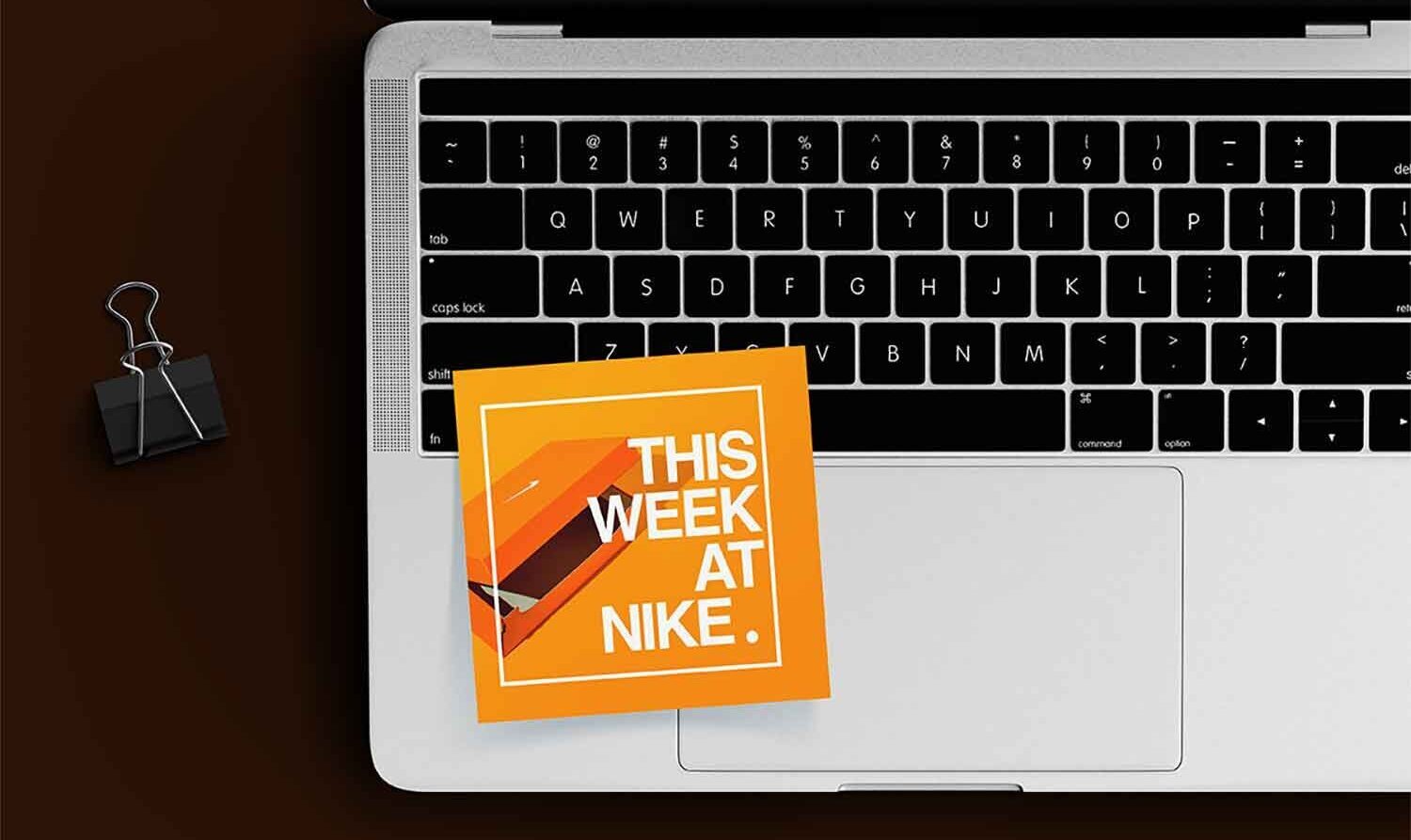
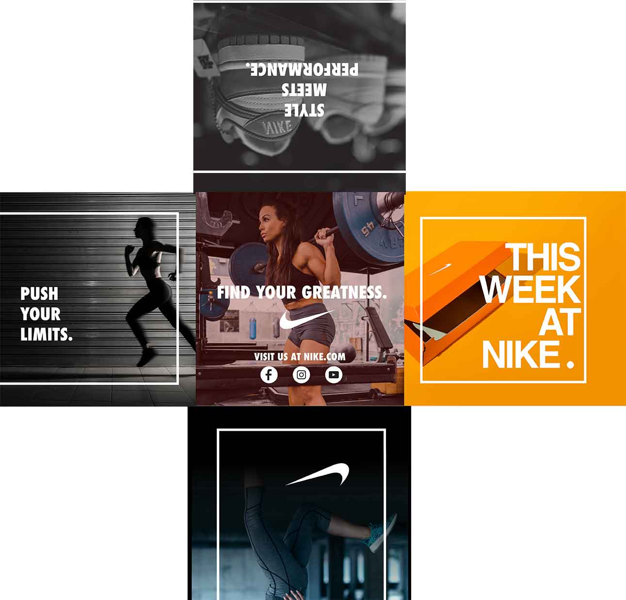
Nike Product Guide
This project is a cross fold product guide created in Adobe InDesign for Nike, designed to promote athletic apparel and upcoming product releases through a bold, interactive print format. The design was intended to be folded into a cross design. I used strong typography, dynamic imagery, and a multi-panel layout to create a design that reflects Nike’s energetic brand identity while maintaining clear hierarchy and visual flow across each fold. This project allowed me to explore publication layout, brand consistency, and designing for a unique folded print structure.
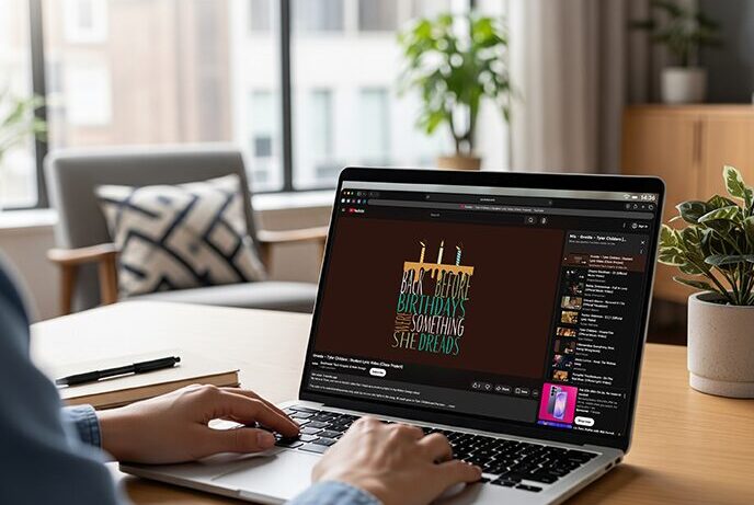
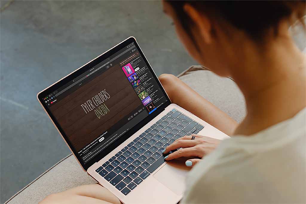
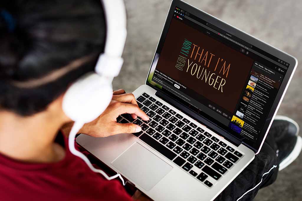
Typographic Lyric Video
This project is a typographic motion design lyric video created in Adobe After Effects for the song “Oneida” by Tyler Childers. I used animated typography, simple graphic elements, and carefully timed transitions to visually support the lyrics while matching the mood and pacing of the song. This project allowed me to strengthen my skills in motion design, kinetic typography, and using animation to create a clear and engaging visual narrative.
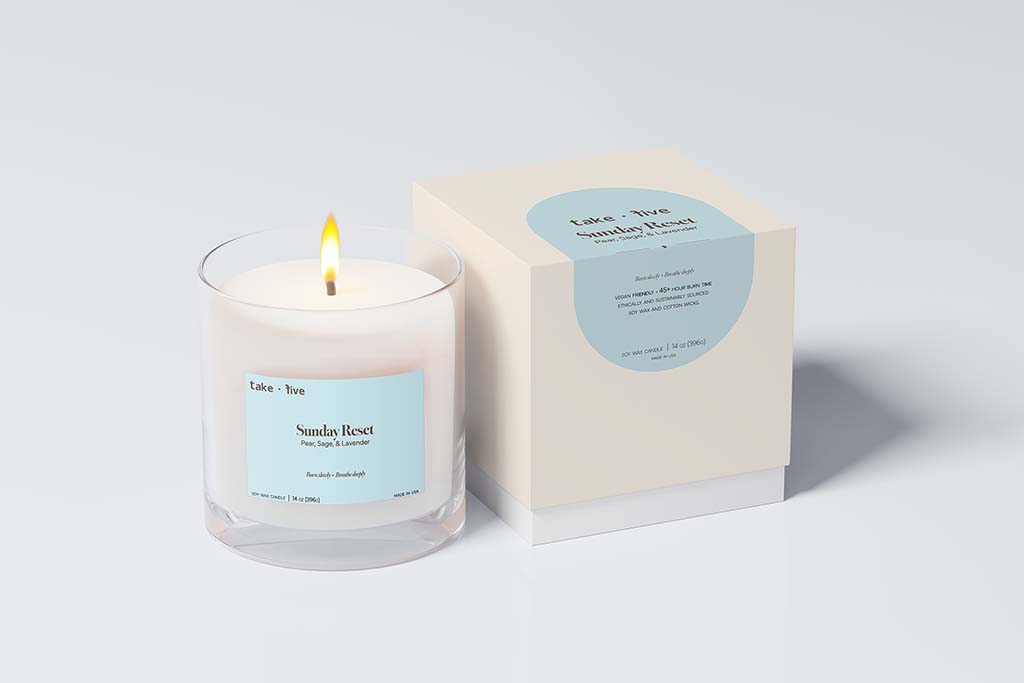
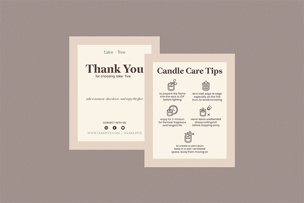
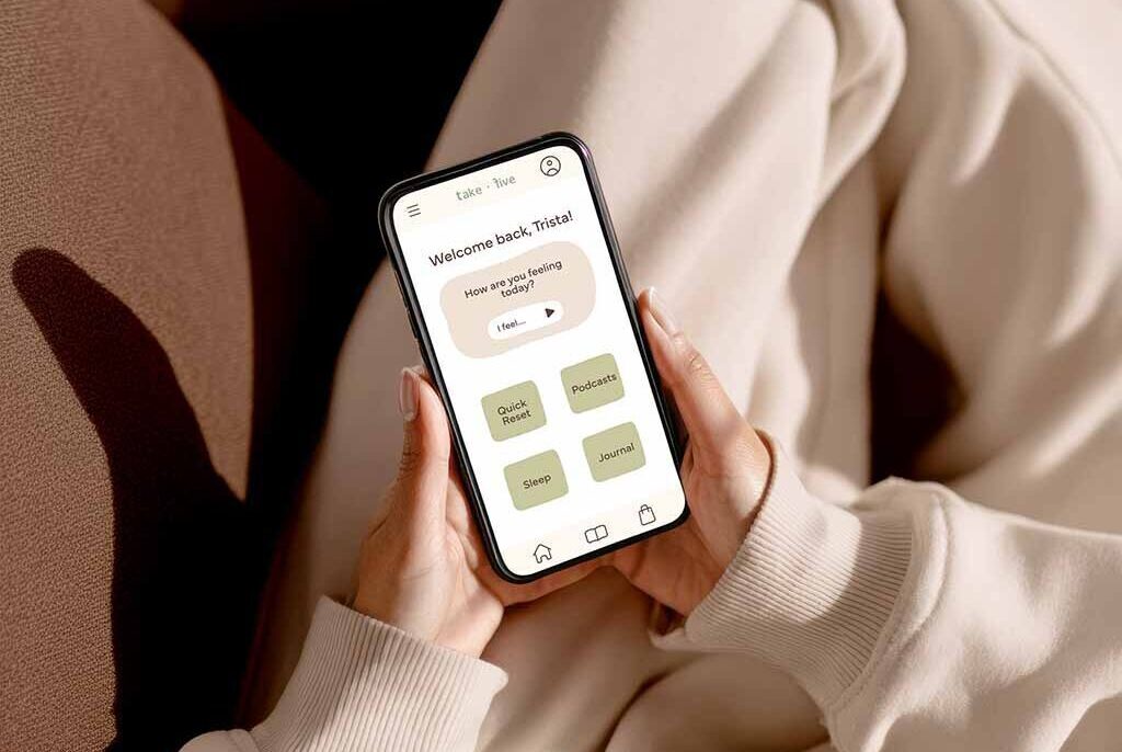
take.five Brand Suite
This project was created as an original brand concept for take.five, a college-focused wellness brand designed to encourage students to pause, reset, and make space for simple moments of care during busy days. Built around the idea that wellness should feel realistic and low-pressure, the brand identity uses calming colors, clean typography, and a soft visual tone to create a modern, approachable experience. To bring the concept to life, I developed a complete identity system across multiple deliverables, including moodboards, typography and color exploration, packaging concepts, candle labels, stickers, mockups, and other supporting materials. This project demonstrates my ability to build an original brand from the ground up by combining strategy, visual storytelling, and cohesive multi-platform design execution.